BRAND DESIGN
ERinfo
ERinfo is a proposed mobile-focused app that I am the UI/UX & Branding Lead of. The app will supply pertinent medical and contact information to medical professionals, particularly emergency responders.
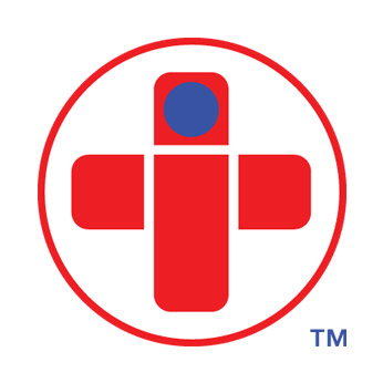
The mark had to embody a sense of urgency and information while maintaining a human touch. To pull this off, the universal cross icon representing emergency was used, but the corners a slightly rounded to look a bit less serious. The intersection is broken apart in a manner that implies a basic human form. The circle could be seen as a human head or the dot of an "i".
The footprint had to be minimal because the mark will have to reside in a variety of formats, and it will have to exist nicely as an app icon. It is enclosed within a circle to stabilize the broken cross and to maintain balance. Red is used to evoke "emergency" while blue is used as a calming medical color.
Helvetica Neue is used for "ER" in the logotype to appear "standard" or "serious". Avenir is a more decorative font used for the word "info" to lighten it up and to evoke a more friendly feeling.
Information about the website and mobile app can be found in the Interaction Design section